Game Development and Media Reviews

Tag: blender

Make Your First Game Asset

Have you ever wondered how to make a video game asset from start to finish? This tutorial covers the creation of fully destructible crates using only the freely available tools Blender, Krita, and Unreal Engine.

Step 1 – Make a Crate With Blender

We start by creating the crate mesh in Blender. We do this by slightly insetting all 6 faces of a cube. The new faces in the center of each side have to be slightly extruded inwards after that.
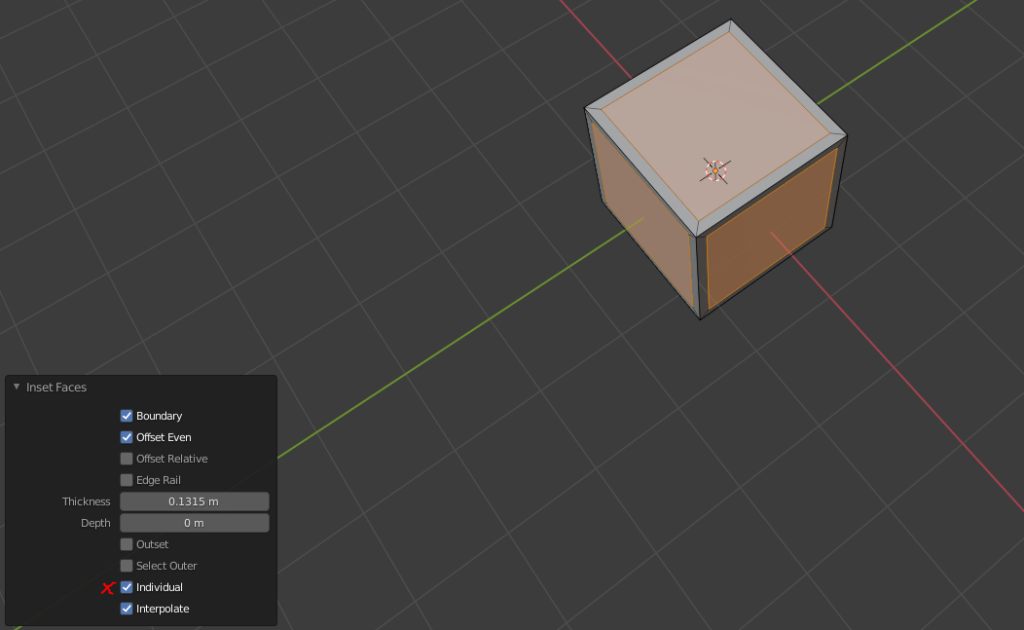
When insetting faces, make sure select every face and to check Individual.
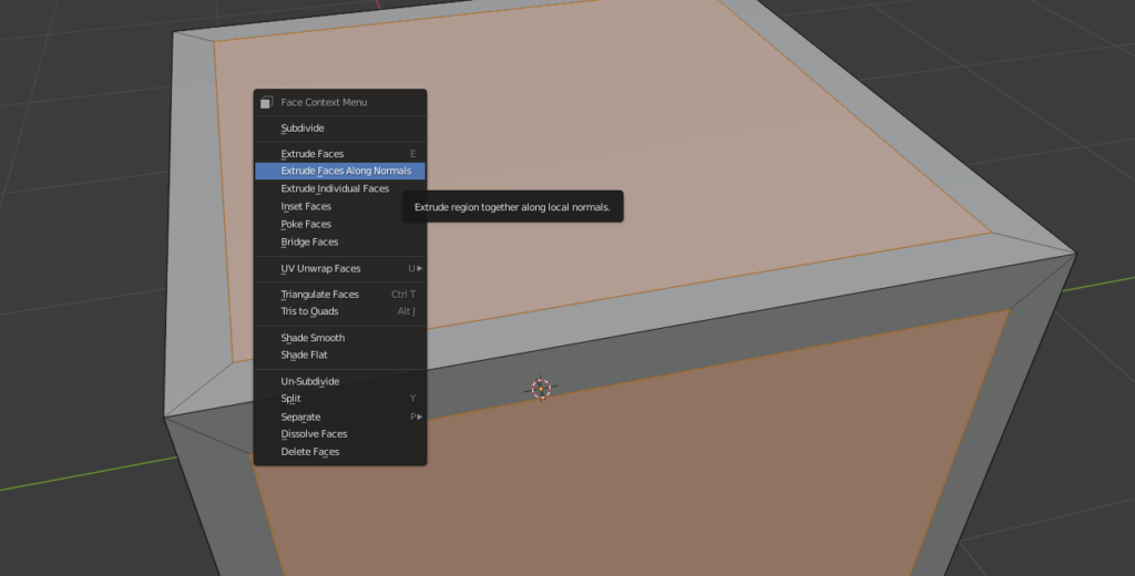
Open the context menu and select Extrude Faces Along Normals.

The crate has be hollow to support the destruction effects within Unreal Engine. Therefore we create a 2nd cube and move it inside our crate. The cube has to be scaled down to be slightly smaller than our crate. We can then use a Boolean modifier to remove the insides of the crate.
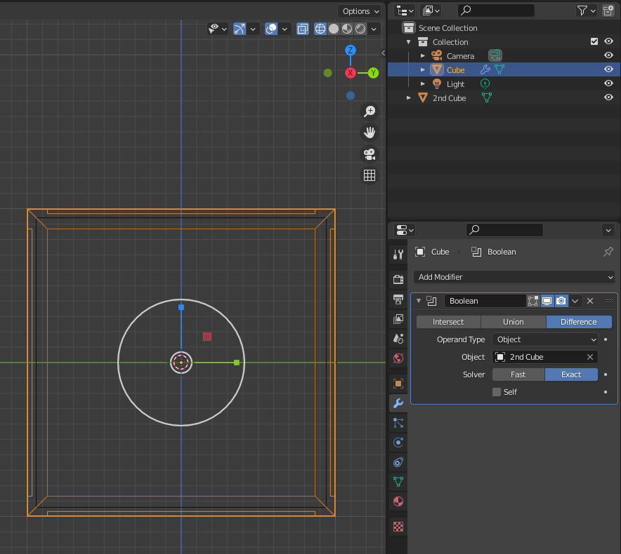
The size of the cube inside of the crate (black outline) determines the thickness of its wooden walls. Create a Boolean modifier and select the 2nd Cube as the Object. Apply the modifier to make the change to the crate permanent. Don’t forget to remove the 2nd cube before export.

Uniform meshes can look pretty boring. I recommend you to add imperfections to the mesh by creating a couple of loop cuts and moving some vertices around using proportional editing. This gives the mesh a bit of character which works great in a low-poly environment.
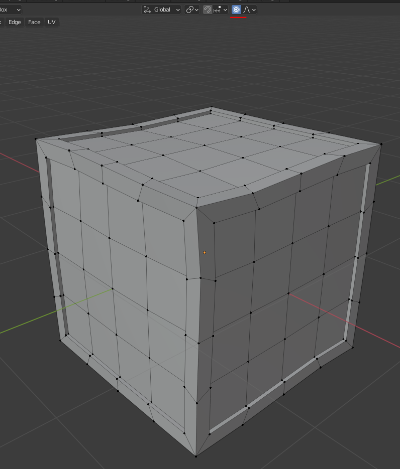
Adding 3×3 loop cuts (CTRL + R) to the cube enables you to slightly deform the crate using Proportional Editing – the sphere of influence can be scaled by using the mouse wheel.

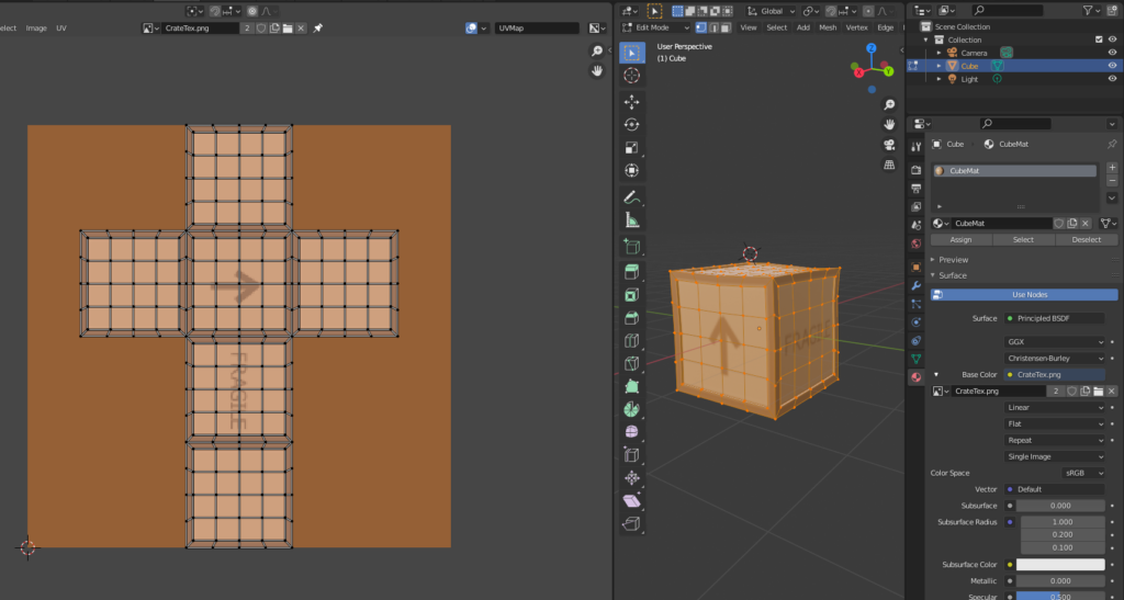
Open up the UV-Editing screen and add a new image with a size of 256×256. Save that image to a file called ‘CrateTex.png’. Select the entire mesh and export the UV-Layout to different file. Create and name a material. Assign it to your crate. Link the base color of the material as a image texture to the newly created image. If you switch the shading mode of your viewport to material preview, your box should appear all black – just like the created texture.
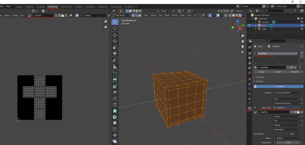
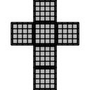
The UV-Layout can be exported under UV -> Export UV Layout.

Step 2 – Use Krita To Make a Texture

Import the UV-Layout into Krita with a canvas size of 256×256. Create a new layer beneath the UV-Layout and fill the background with a darker brown. Select the square areas in the center and paint them in a lighter tone. Feel free to add some details like a text saying ‘FRAGILE’ or paint an arrow pointing up.
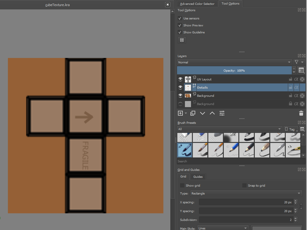
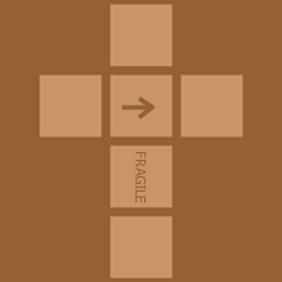
Hide the UV-Layout layer before you export the result back into the texture file.
Reload your texture in Blender (Alt + R) and verify that everything looks correct.
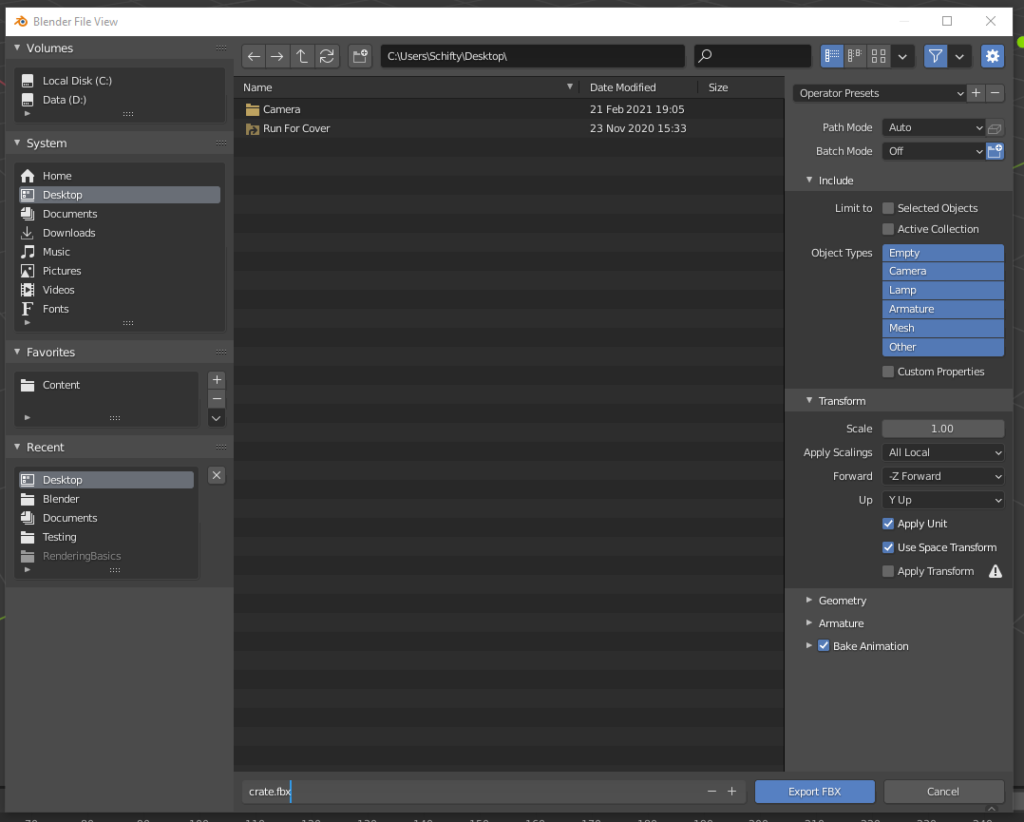
Export the crate into an FBX file.

Step 3 – Create a Destruction Effect In Unreal Editor

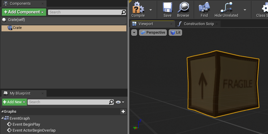
Create a new First-Person blueprint project in Unreal Editor. Import the created FBX and the texture by simply dragging the corresponding icons into the editor.
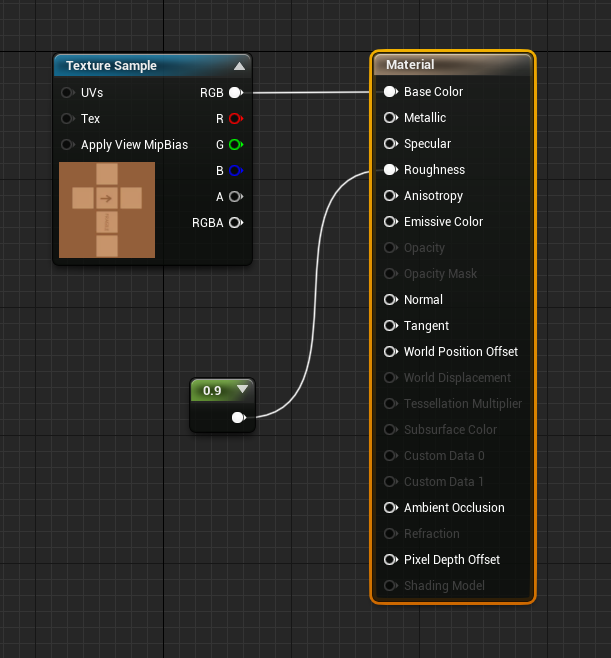
Edit the imported material and make sure that the texture is sampled. Set Roughness to 0.9.
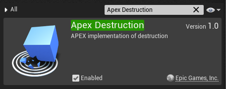
Go to the Plugins window and make sure ‘Apex Destruction’ is activated. Otherwise, the option to ‘Create Destructible Mesh’ will be missing.

Click on the imported static mesh and click on ‘Create Destructible Mesh’.
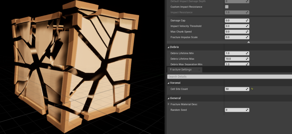
Open up the destructible mesh and play around with the ‘Cell Site Count’ to control the size of the resulting fragments. A higher number means smaller fragments.
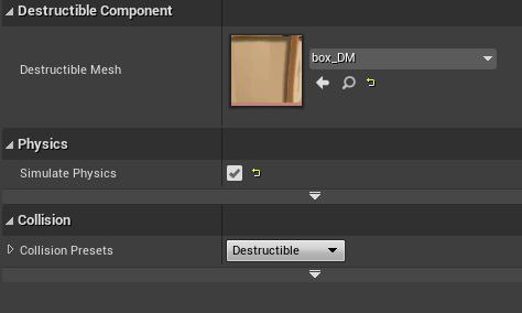
Create a new actor called ‘Crate’. Replace its root component with a destructible component.
Link the component to your destructible mesh. Check ‘Simulate Physics’ on the component.
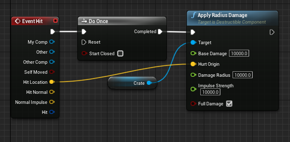
Make sure to apply radius damage to the mesh

Place the box in the level by dragging the actor into the viewport. Shoot at it.

Step 4 – Make It More Interesting

Hope that helps.

How To Get Started With Blender and Unreal Engine

Learning how to create simple models with Blender that you can actually use for game development might seem impossible to a lot of people, especially to programmers who don’t feel like they are artistically inclined. However, after +50h of practice, I found myself having the confidence to create simple game assets myself. Here is how I got started.

I stumbled upon a couple of very interesting Blender tutorials by Grant Abbitt on Youtube. He teaches very simple techniques for absolute beginners and his videos feel more or less like a mixture between painting tutorials a la Bob Ross and Lego instructions. These Beginner Exercises are very easy to follow but often ask you to try things out for yourself first before continuing with detailed commentary.

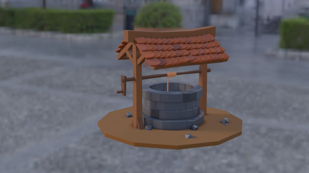
After finishing the first four beginner exercises, I started to look into creating an actually usable asset. This is when I jumped to the Low Poly Well Tutorial. This tutorial consists of three parts and yielded a very decent result. I especially liked how this tutorial challenged you to create some of the easier stuff yourself. This gets you into the right mindset by forcing you to think and plan ahead when modeling.

The well tutorial teaches you how to add different colors, bumps, and dents to your mesh in order to combat uniformity and to create a visually interesting result with a bit of character.

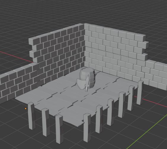
After finishing the well tutorial, I wanted to move on to something bigger – something that I could export to Unreal Engine, something I could animate and show off. I wanted to create a product that people would like and enjoy. The ideal guide to support that goal was the Sea Shack Tutorial. The tutorial consists of twelve parts but the actual geometry was modelled in the first six. The construction of the shack is briefly explained but you are left on your own after modeling the lower platform. The creation of twelve easy objects in the scene is skipped too. However, the shack and the other minor models should be pretty easy to recreate with the previous tutorials in mind.

The final result in Blender. I added a camera path with a little dip in the back to get the most out of the scene. There are some screen space reflection artifacts remaining that I was not able to fix.

Getting Your Assets Game Ready

In order to make the assets available in Unreal Editor I had to export the scene as an FBX file that can be easily imported. Joining all elements of the scene together enables you to easily transfer the whole scene layout as a single static mesh to Unreal Editor. Make sure to name all the materials you are using because those names are used to create material assets in Unreal Editor during import. Most material assets need at least a little tuning when it comes to shininess. Cloth materials require back-face culling to be deactivated as both sides of the mesh need to be rendered. The recreation of the water material needs most of your attention though.

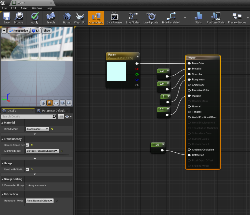
The most complicated material to recreate in Unreal Editor is the water material. Make sure to set the render mode to Translucent and activate the checkbox next to Screen Space Reflections.
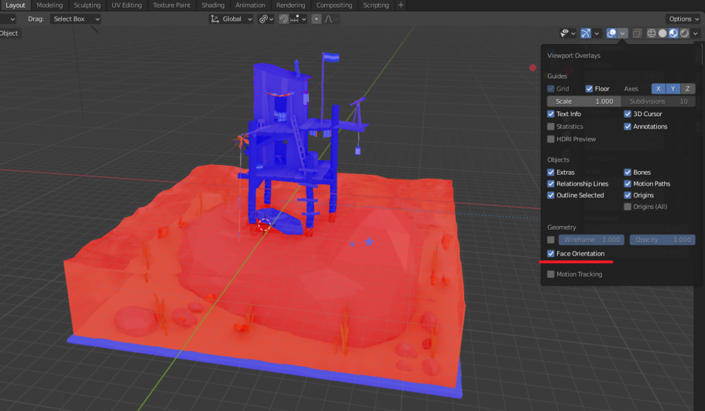
During the modeling process in Blender, some normals might have been flipped. Objects with flipped normals will not be rendered correctly due to back-face culling. You can check your normals by activating Face Orientation. Blue faces are rotated towards the camera and are fine while red faces are not. This can be fixed by pressing Alt + N -> Flip in Modeling mode.

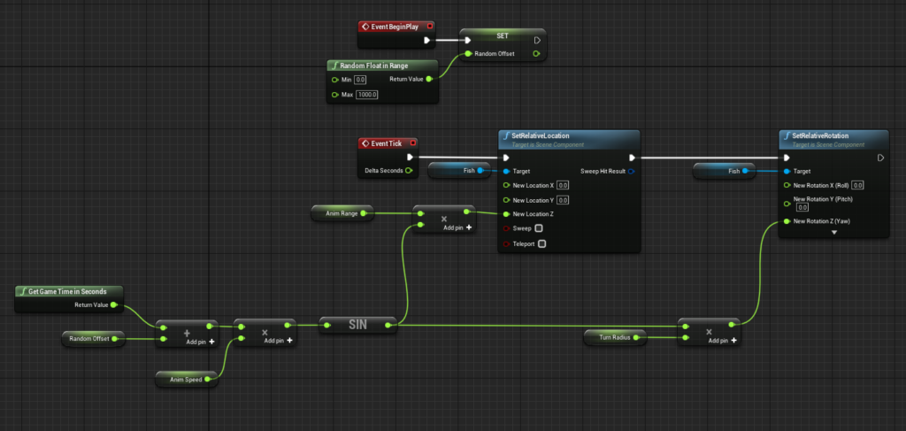
After the initial import of the scene with all components joined together I removed the fish meshes from the Blender scene and exported a single fish mesh separately. I wrapped the fish mesh in a fish actor that is animated via Blueprints. The fish actor was then placed, scaled and rotated multiple times to replace all previously existing meshes. You need to do this for every additional element like the seaweed or the flag that you want to see animated.

The animation blueprint for fish moves and rotates the mesh slightly back and forth. The random time offset is helpful to prevent a uniform animation look.
I presented the final result from Unreal Engine on reddit to figure out the market appeal and received over 600 upvotes. The negative comments focused on the chosen coloration.

While I’m personally really happy with the result I do think that the scene and I might benefit from additional optimization:

  • This little animation currently requires 30 single color materials. This number could be vastly reduced by mapping a texture onto the mesh.
  • The walls of the shack consist of multiple individual boards. The number of vertices could be reduced by using a single simplified mesh and a normal map.
  • Bones and Rigging could be utilized to improve the fish animation.

Hope that helps.

A Beginner’s Guide To Rendering

Understanding computer graphics is hard. It is even harder to figure out where to start. This guide aims to provide a top-level understanding of common terms and processes that make pictures happen. The examples are implemented using Blender and Unreal Editor and do not require any programming or art skills.

Vertices

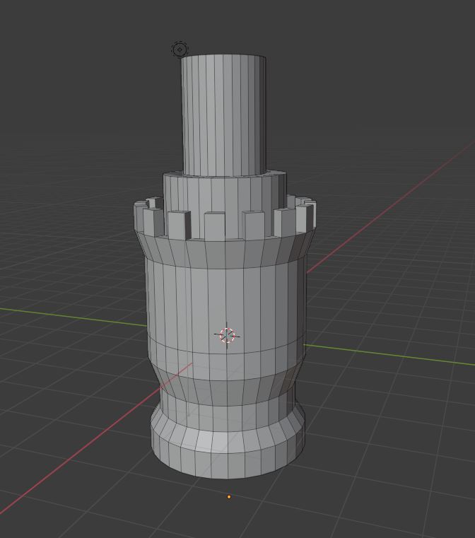
Vertices are an important building block of computer graphics. A vertex is a single point in a virtual space that can be implemented in multiple different ways. The most basic version of a vertex in a 3d space consists only of the values X, Y, Z that represent its position. Vertices are commonly used to define lists of triangles that represent a 3d mesh because triangles can be easily rendered by GPU programs called shader.

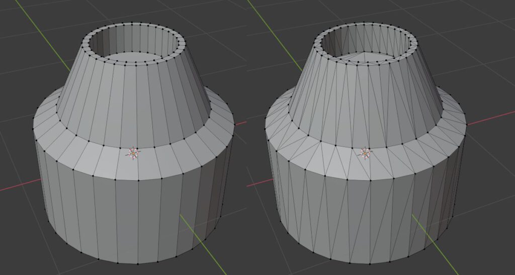
When working with 3d editing software like Blender you will be presented with quads instead of triangles as quads are easier to shape into complex models. The mesh will be automatically triangulated during export to be later used in your game engine.

Back-Face Culling

Triangles have a front-face and a back-face. Usually only triangles facing the player are rendered as this almost halves the number of triangles that have to be rendered on screen. This technique is called back-face culling and leverages the assumption that you shouldn’t be able to see the back-faces of solid 3D objects.

Back-face culling is off: The back-faces of this object are visible and take up valuable resources. This is typically unnecessary as most objects do not have holes in their mesh.
Back-face culling is on: The back-faces of this object are invisible and we render only the outside of the object as we assume that our objects typically don’t let us look inside of them.
The material settings of Unreal Editor allow you to deactivate back-face culling for each material.

UV-Mapping

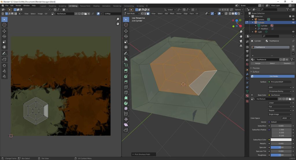
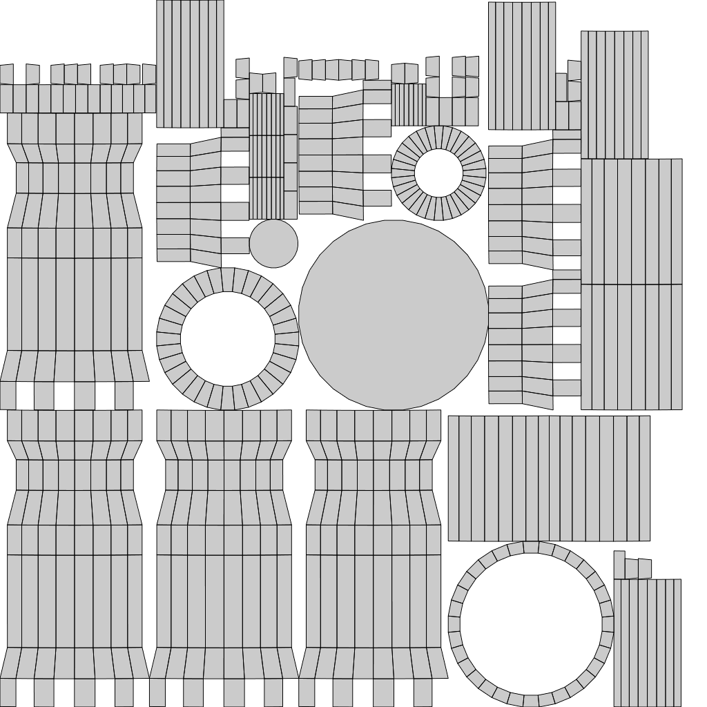
The first common extension of vertices are a set of texture coordinates usually referred to as UV-coordinates and are used for a process that is called UV-mapping. The two values u and v are ranging from 0 to 1. They reference a point in the 2d space of an image with (0.5, 0.5) representing the center. If you create a triangle in 3d space with 3 distinct UV-coordinates you can visualize that triangle in the textures 2d space. The UV-coordinates for each rendered pixel of the triangle are interpolated and used to look up a specific pixel from a texture in a process called texture-sampling.

UV-coordinates are assigned to a mesh. A shader can use these coordinates to sample the texture.

Normal Maps

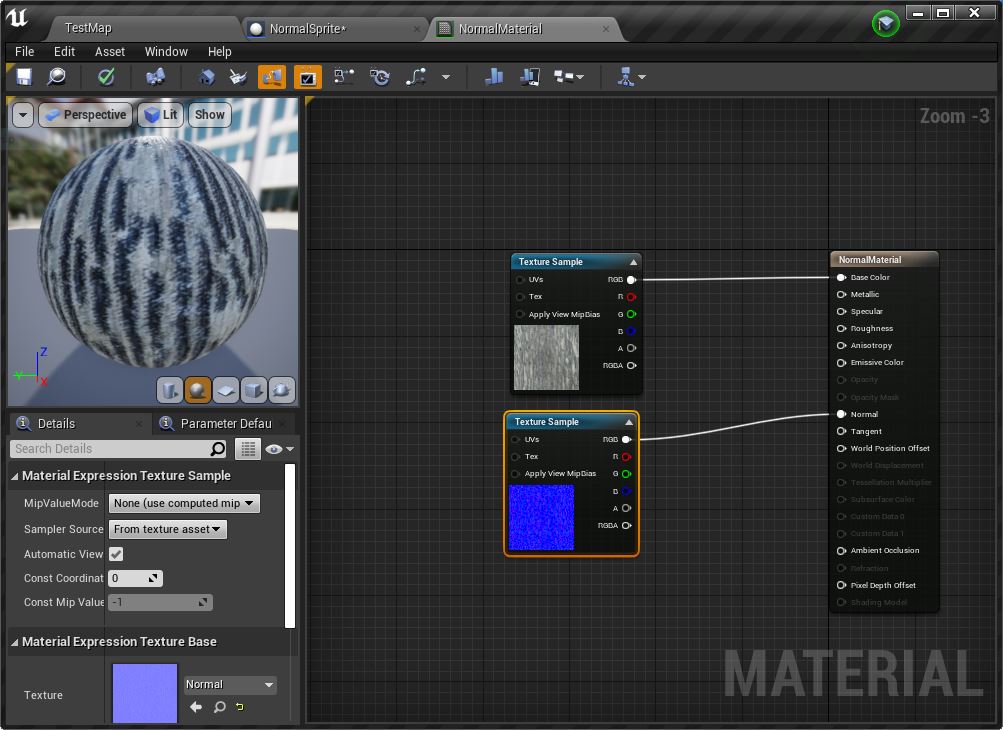
The combination of UV-mapping and texture-sampling can also be used to implement normal-maps to create more detailed models without using more vertices. Normal maps are used to ‘bend light with math’. This creates an illusion of bumps and dents that are missing from the mesh.

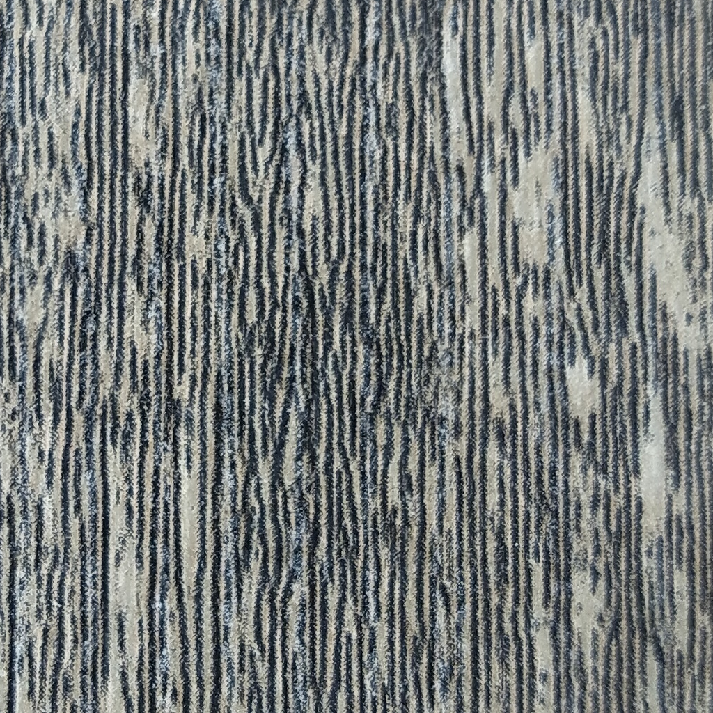
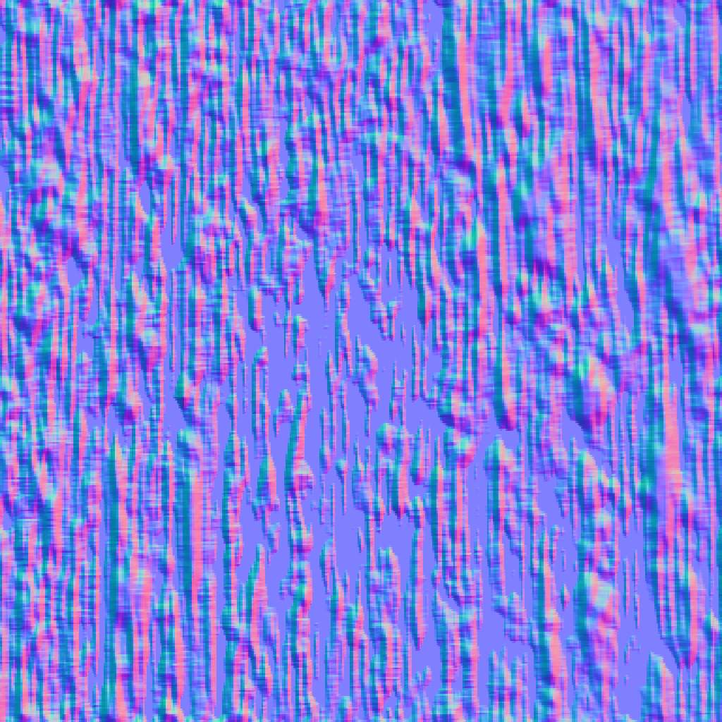
I created the texture by taking a picture of my coffee table and cropping it into square dimensions. The normal map was based on that texture and created with a process called baking normals using Blender. The added normal map creates the illusion of deep ridges that are not really there. Creating a mesh with that level of detail would require a lot more resources than just adding a normal map.

Texture Masks

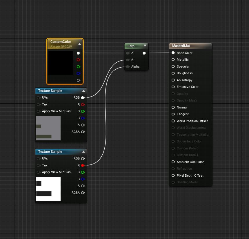
UV-Mapping can also be used to implement texture-masks to enable color customization. Masking a texture is similar to setting up the texture itself. You assign texture coordinates to the 3d model and paint the areas you want to mask. The mask acts as a switch between the texture and a dynamically specified color on each rendered pixel. A common RGBA texture mask comes with 4 switches that enable you to blend and combine a total of 5 textures.

The colors of the marked areas of the mesh can be adjusted easily while preserving the rest of the texture. Masking is commonly used in character customization or to color code team members.

Vertex Color

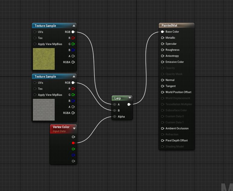
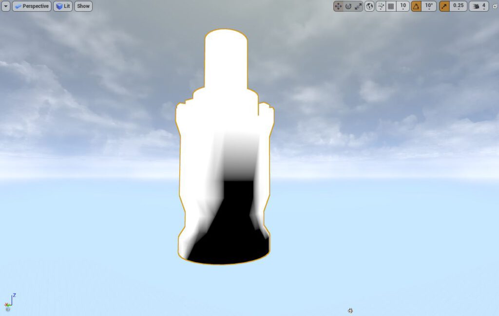
Another common extension of vertices is the addition of a vertex color. A vertex color is usually represented by 1-4 values but can be even higher depending on the use case. Vertex color is used to mix and blend textures on terrains or walls that would otherwise look very stale. This is achieved by associating each value of the vertex color with a different texture and by blending accordingly. This effect works better with models that have lot of vertices as vertex coloring with very simple meshes does not allow for enough details.

The vertex painting tool in Unreal Editor enables level designer to paint right on the mesh.
A Quick Comparison
Vertex ColoringTexture Masking
– no additional texture required
– quality depends on vertex density
– information stored in vertices
– designed to create endless variations
– used for level design
– information stored in texture
– independent of underlying mesh
– typically one mask per object
– designed for dynamic coloring
– used for gameplay features
Vertex Coloring and Texture Masking both implement texture blending but have different use cases.

This was just a quick peak into the world of rendering techniques. Let me know what you want to see next.

Hope that helps.

© 2024 Schifty's Blog

Theme by Anders NorenUp ↑